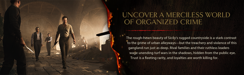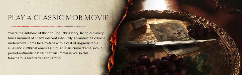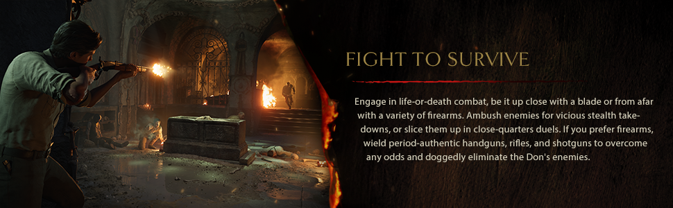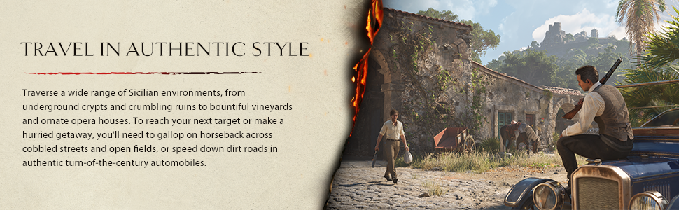
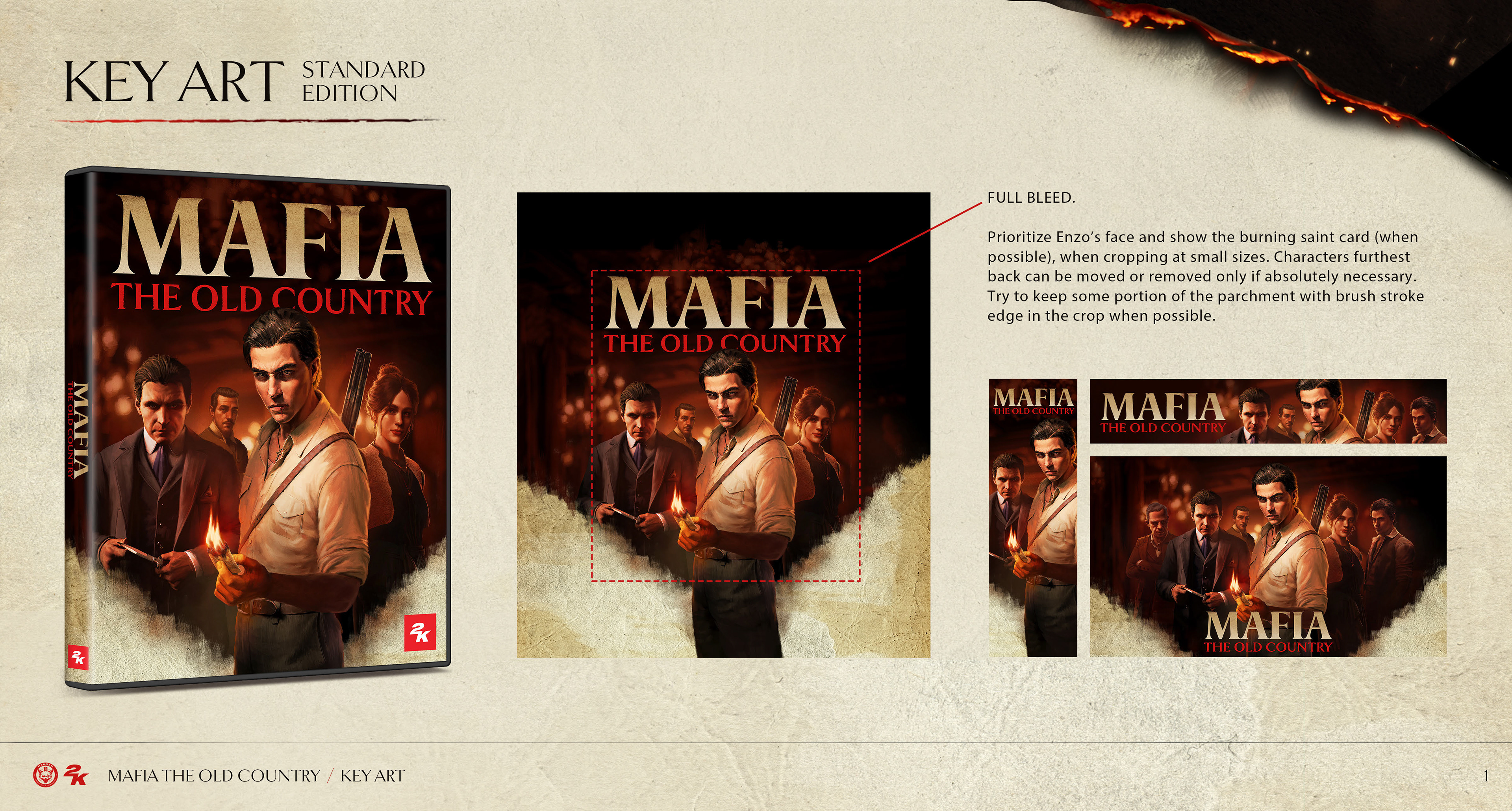
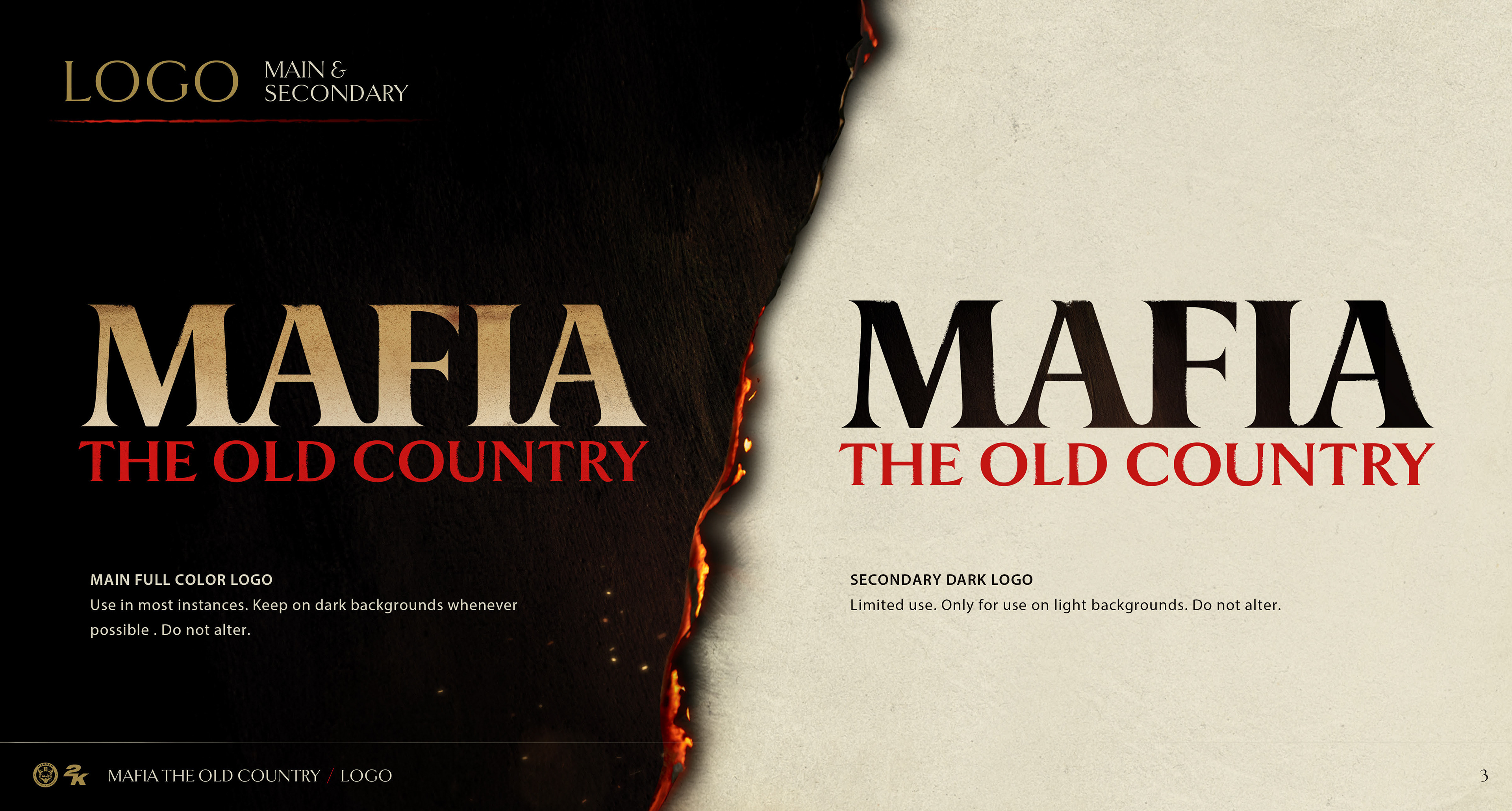
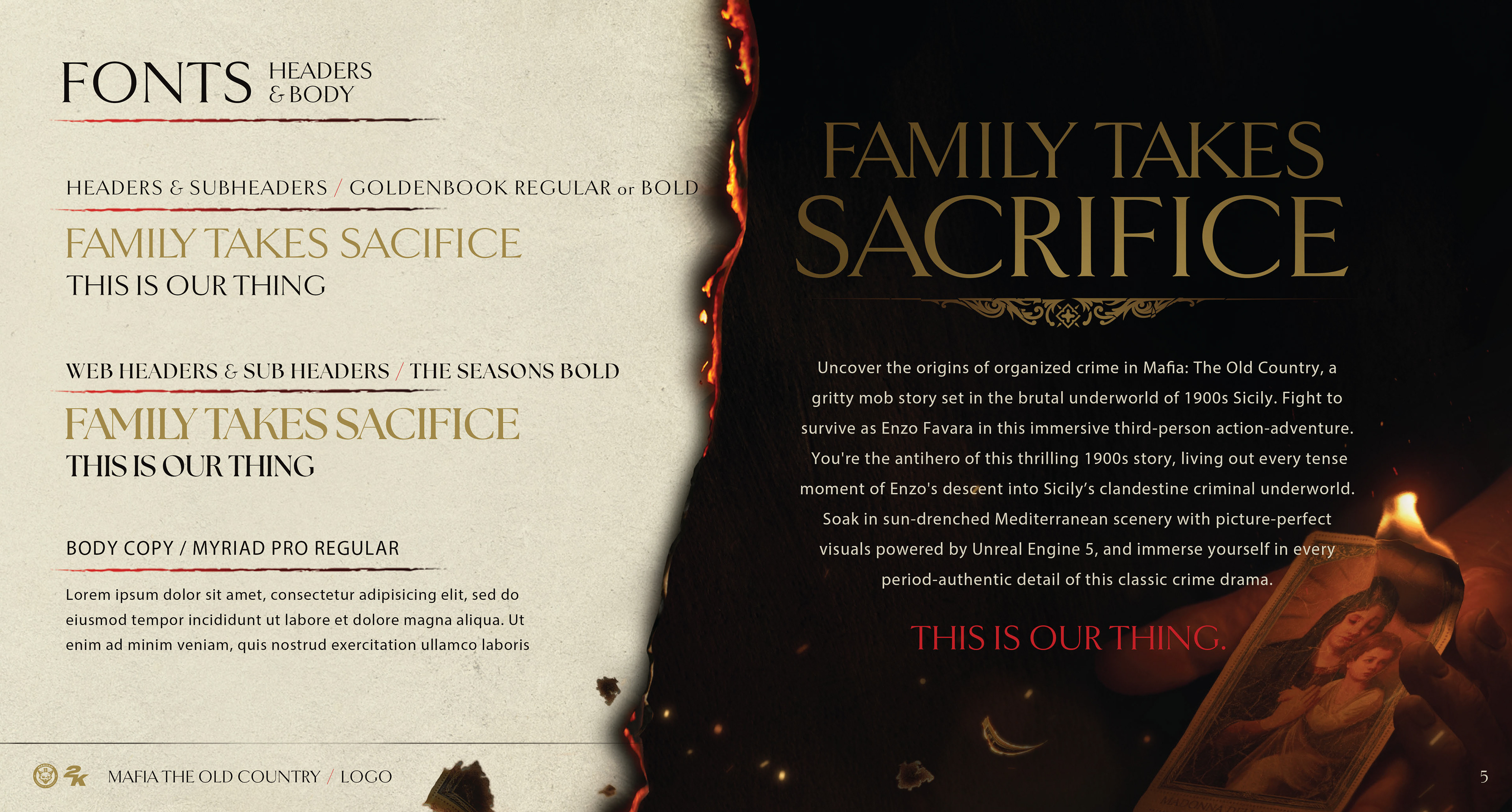
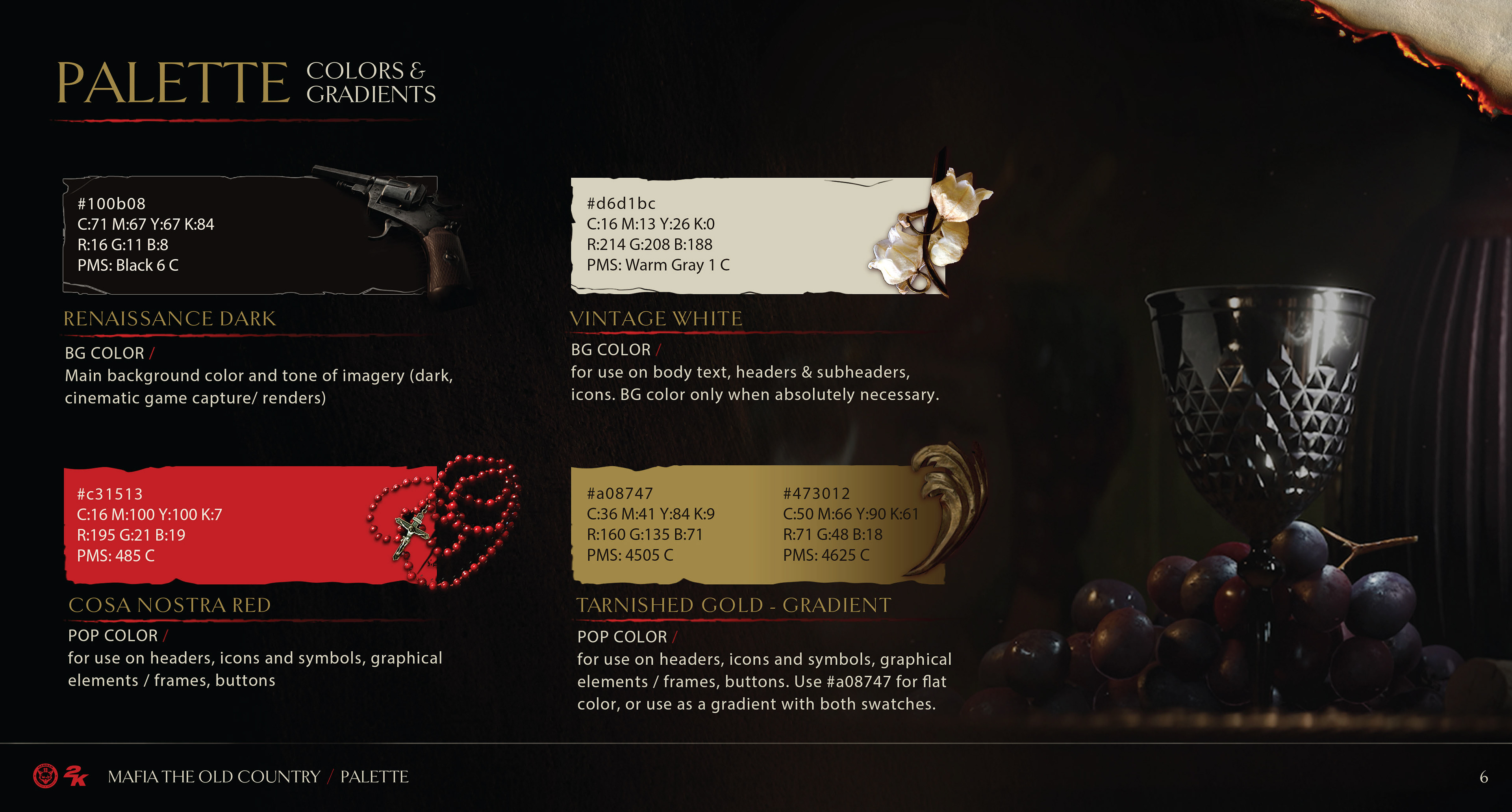
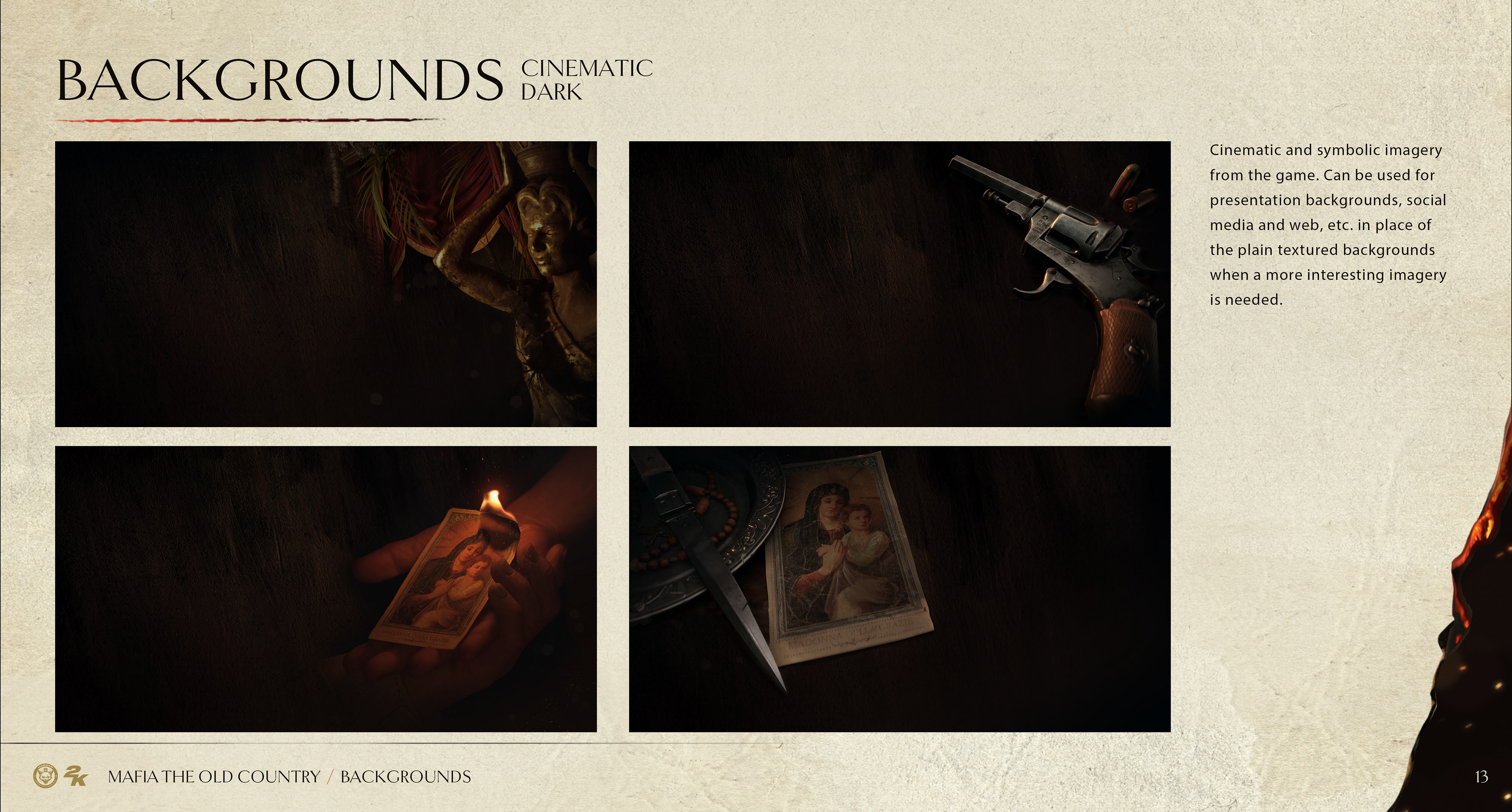
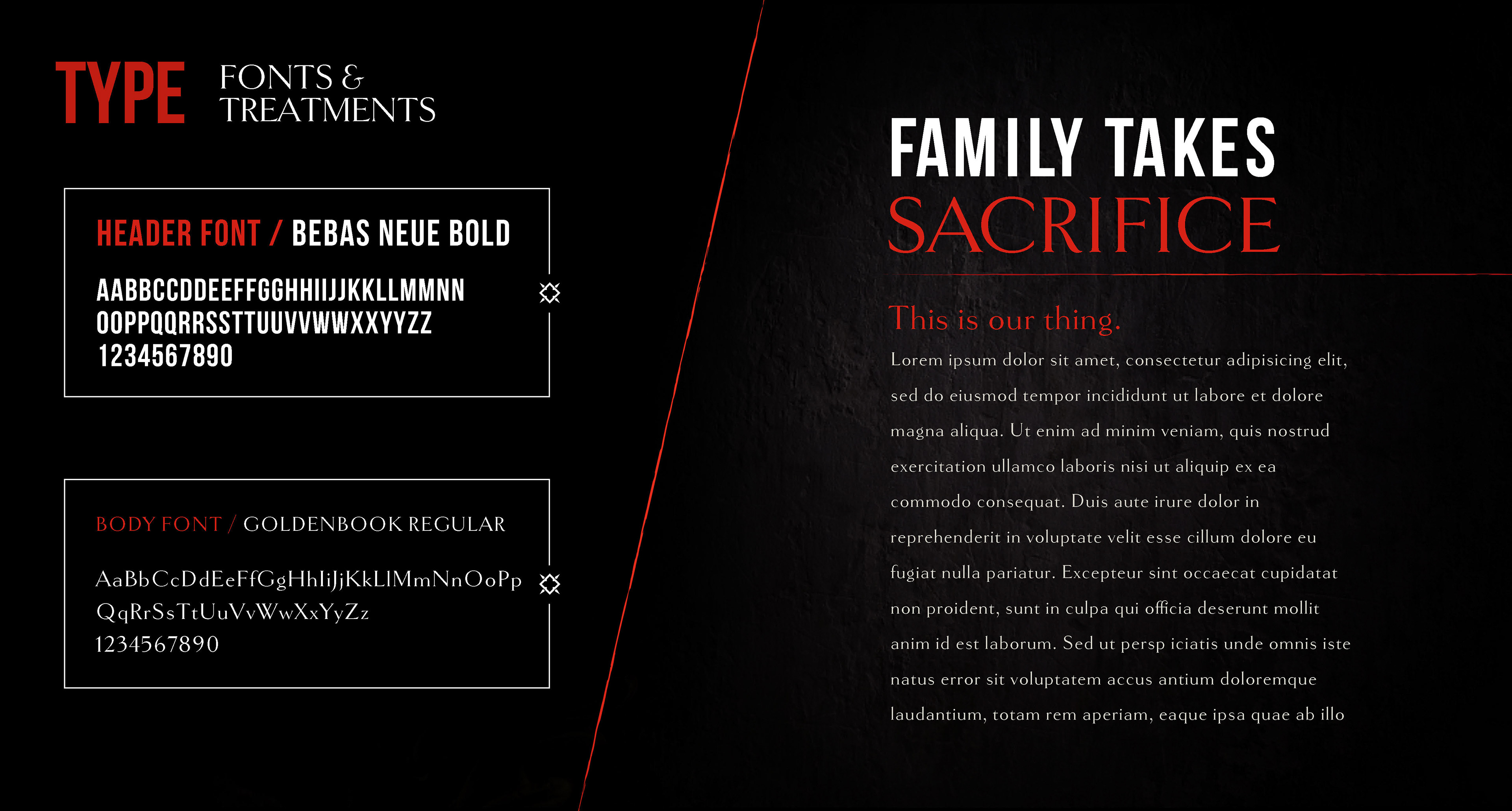
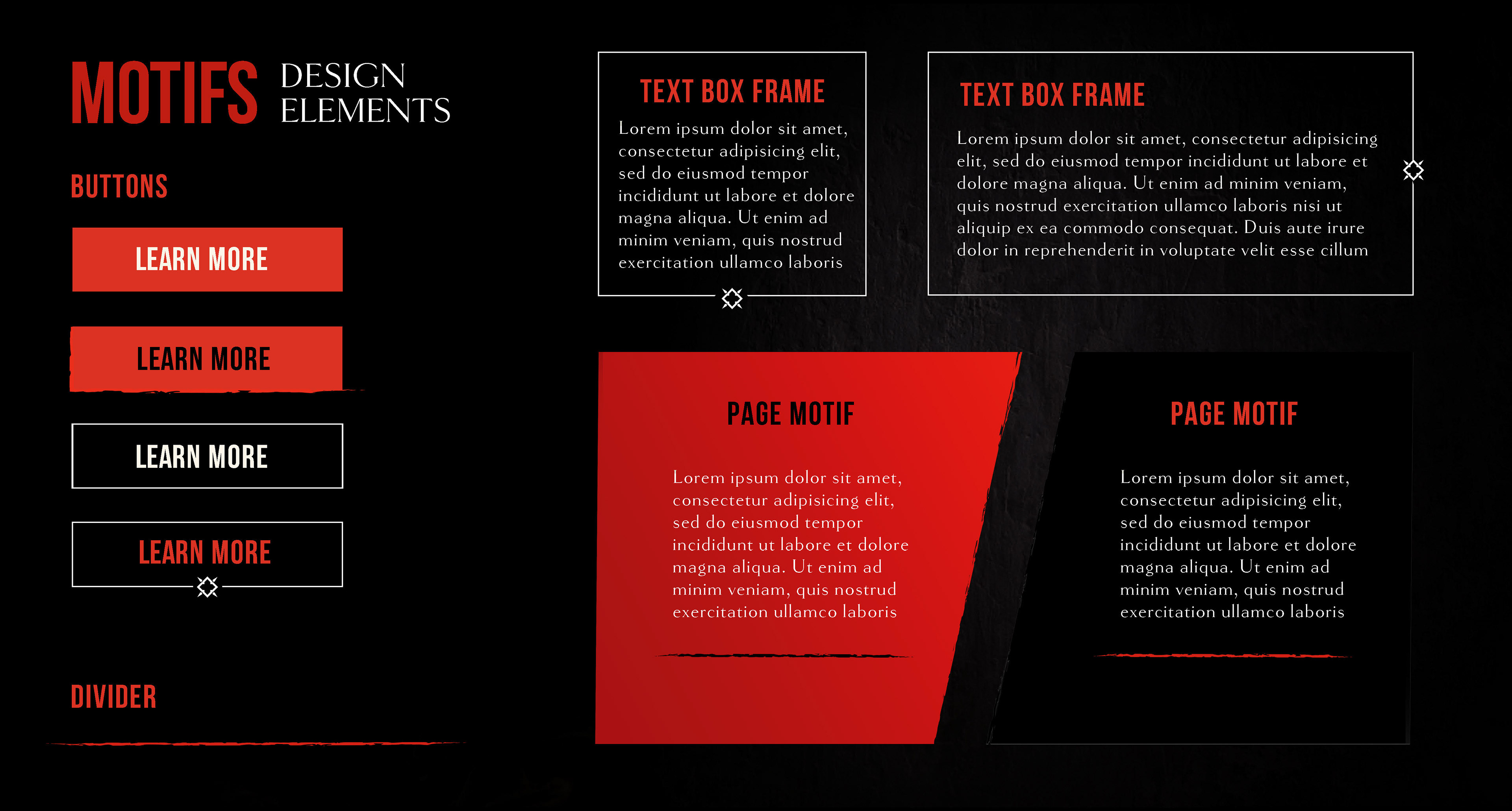
Marketing Toolkit
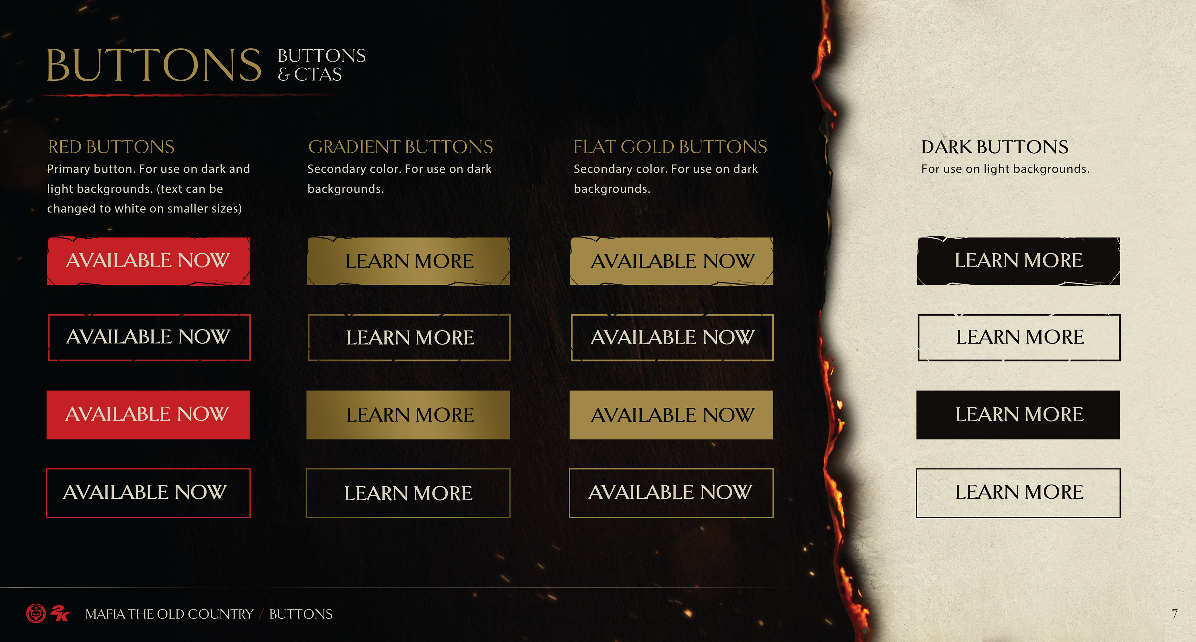
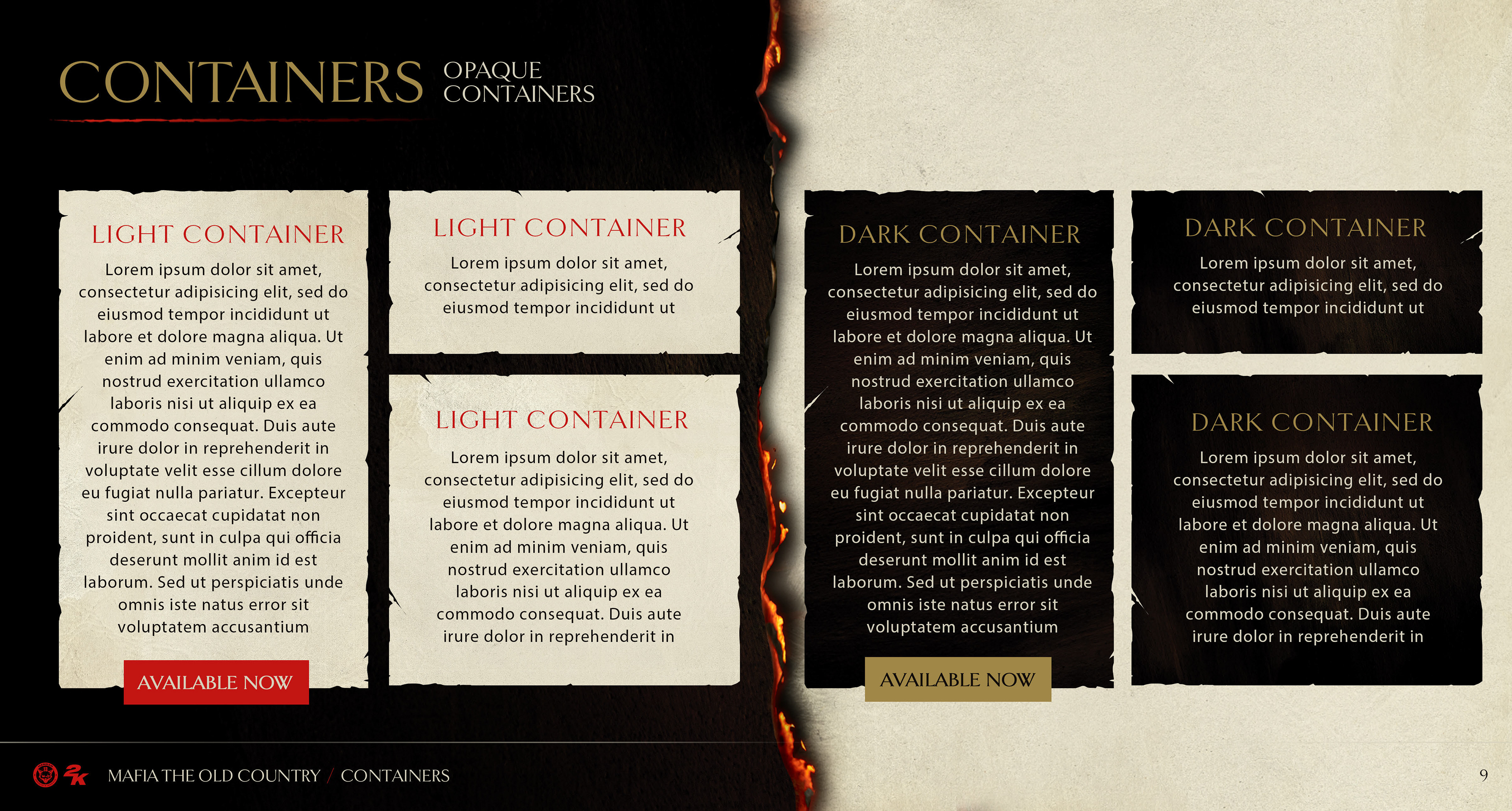
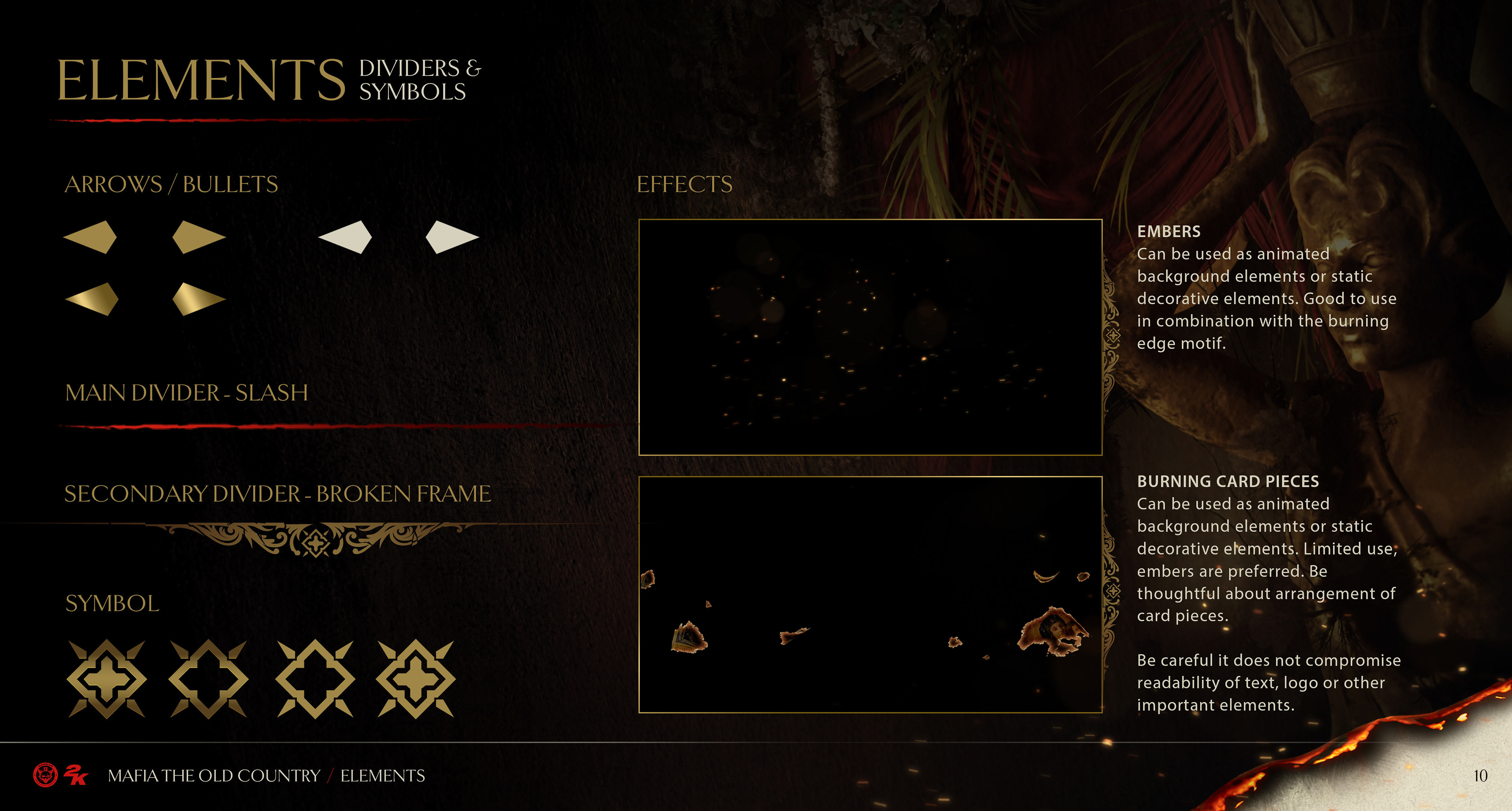
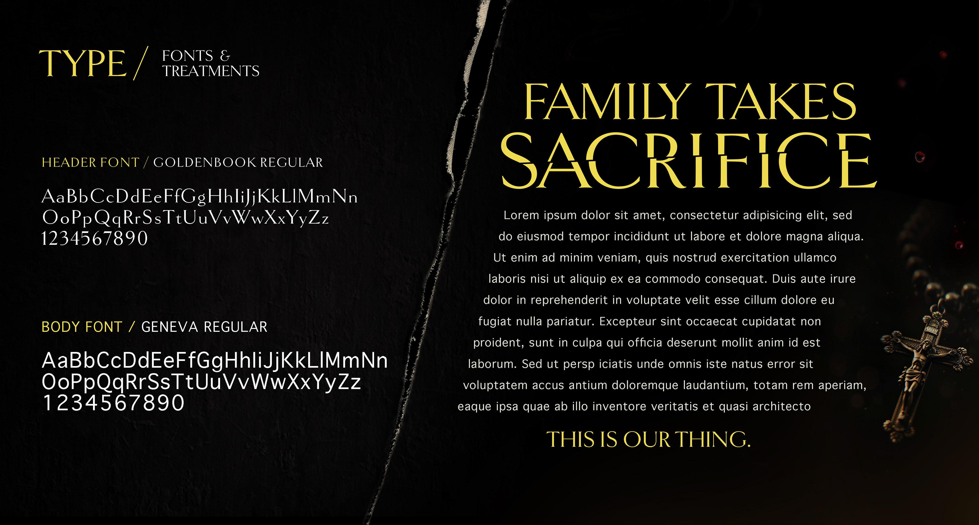
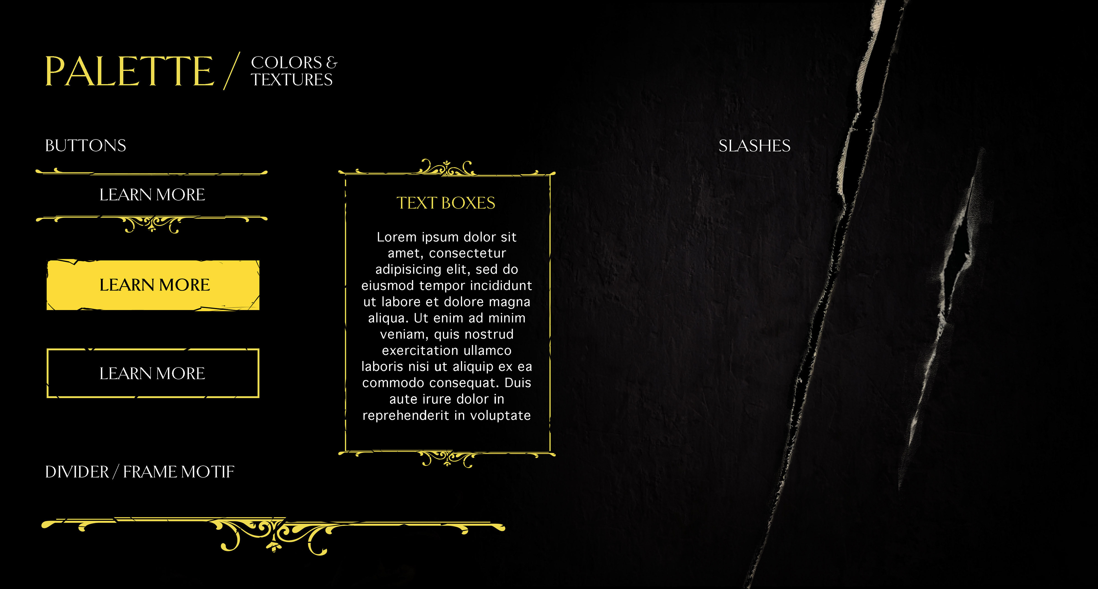
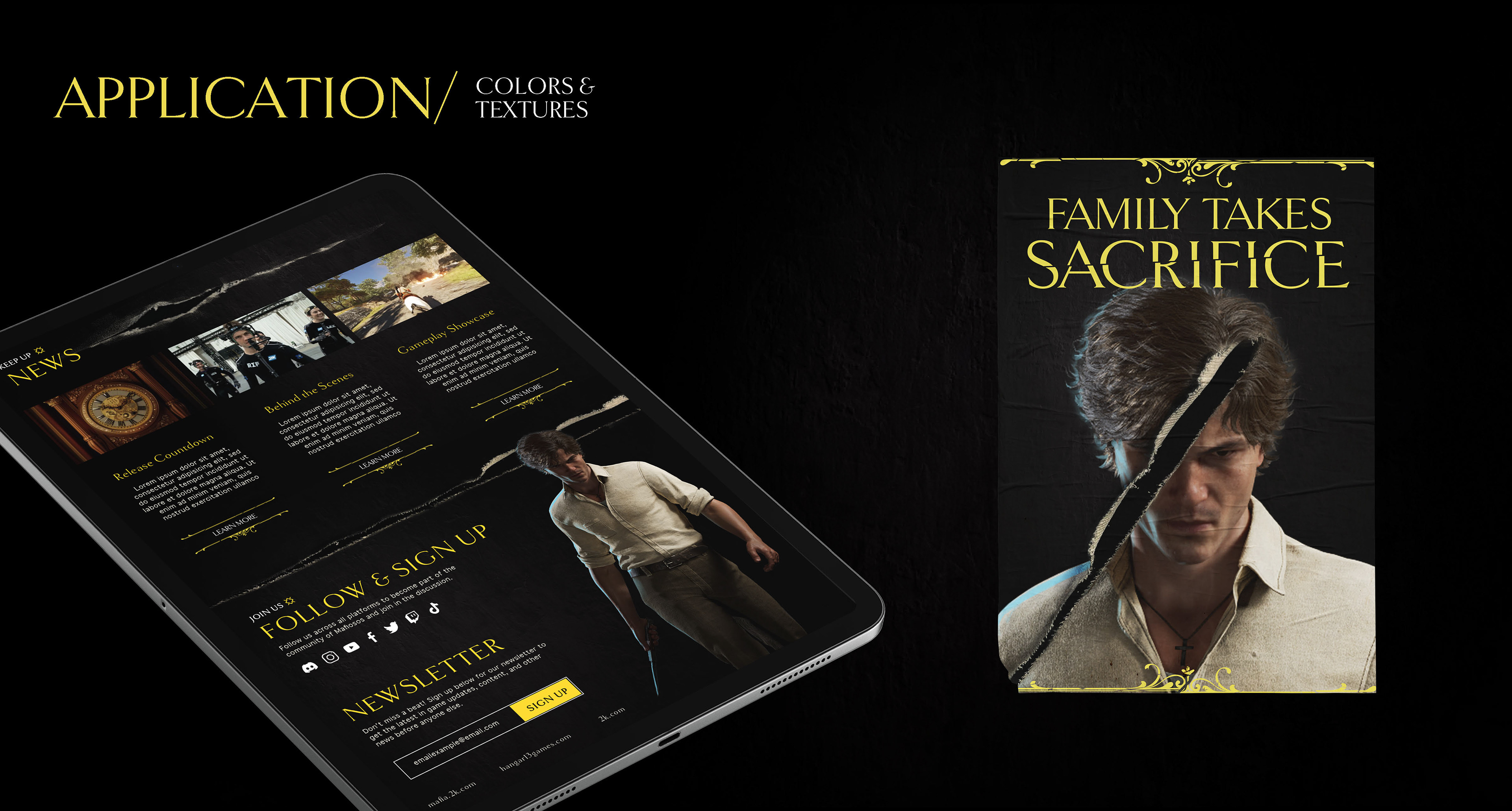
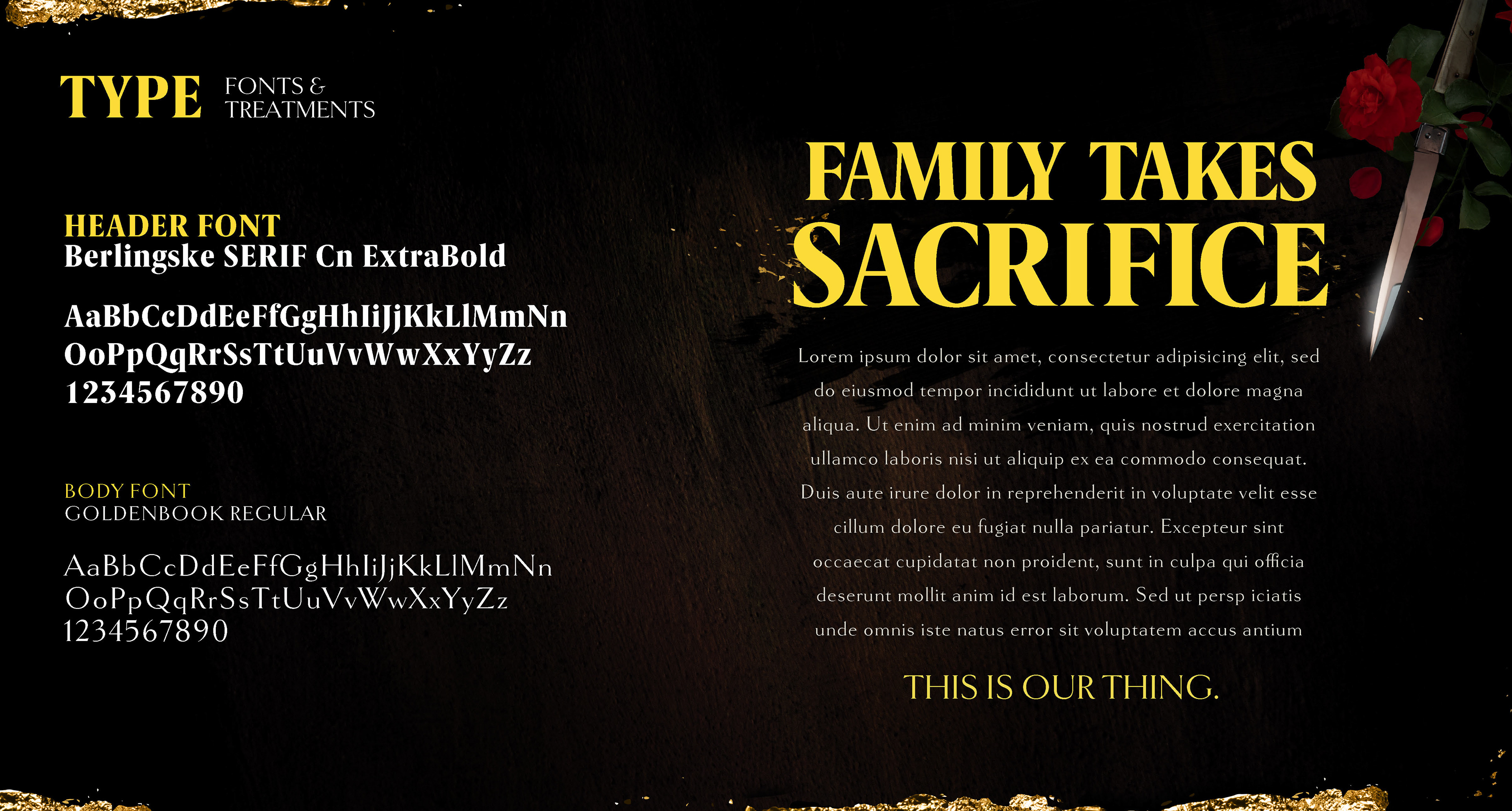
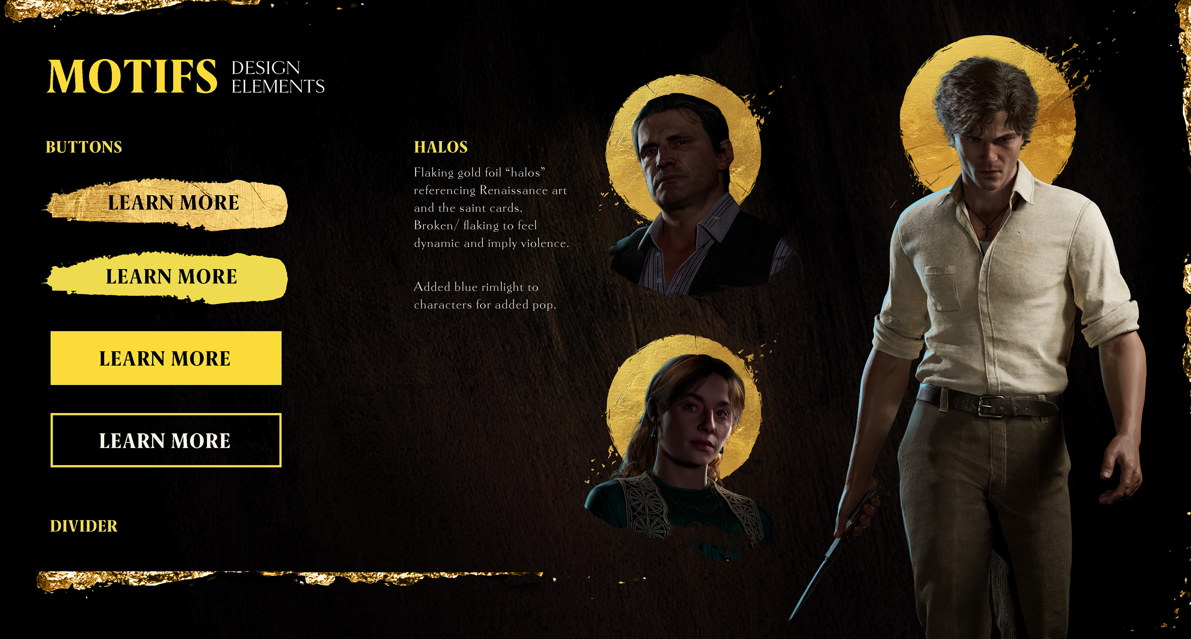
I was tasked with working with the developers at Hangar 13, as well as the art directors and stakeholders at 2K, to develop the look and feel of our launch marketing for the new Mafia title. This includes determining the final art direction by creating assets like backgrounds, textures, motifs, color palettes, font styles, buttons/ design elements, and application examples and compiling that information into a document for designers to use. The toolkits are a vital part in keeping our brand identity recognizable, consistent, and high-quality, while communicating the mood and tone of our game. Below are a few pages from the toolkit document I created.
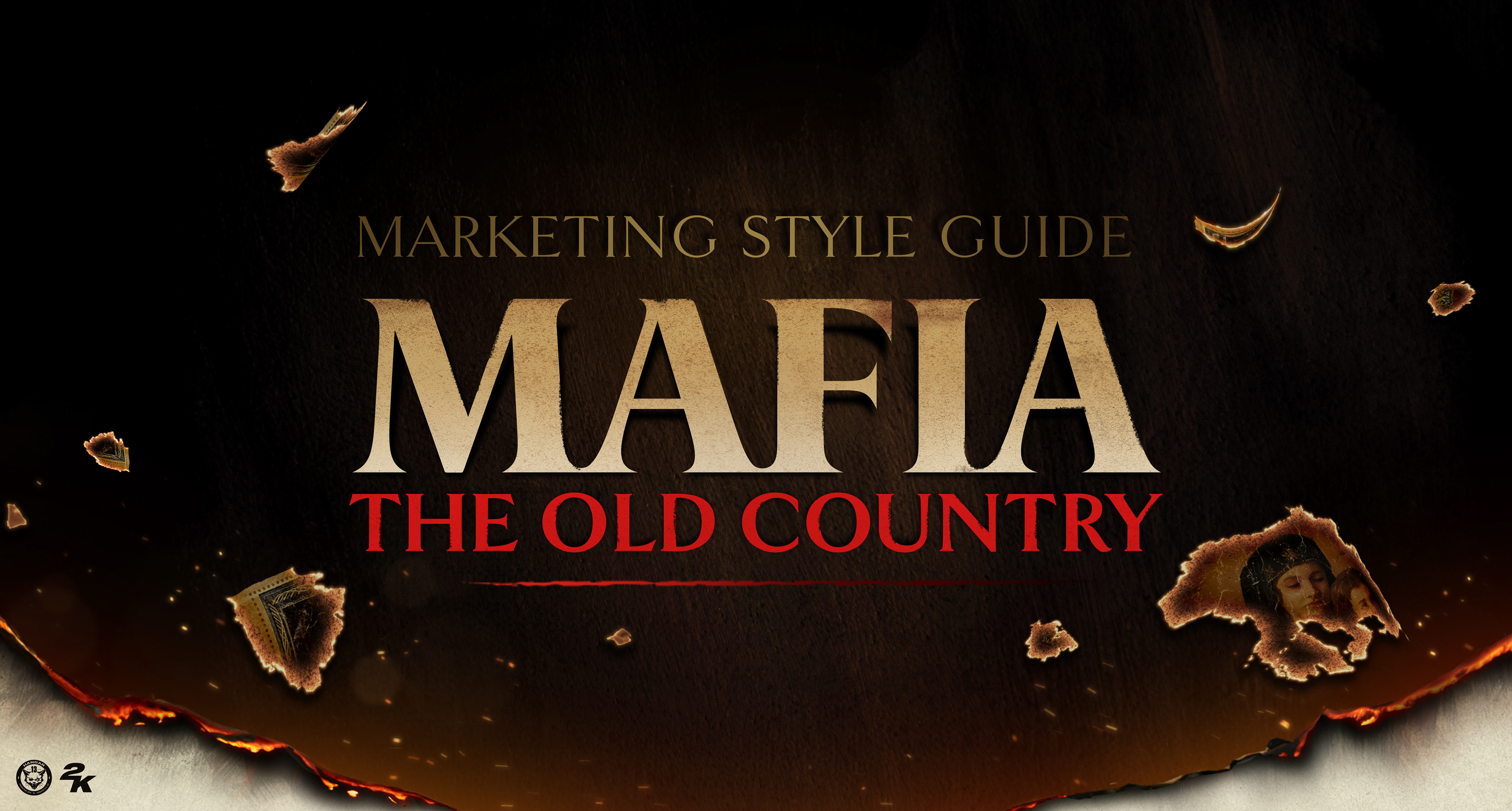
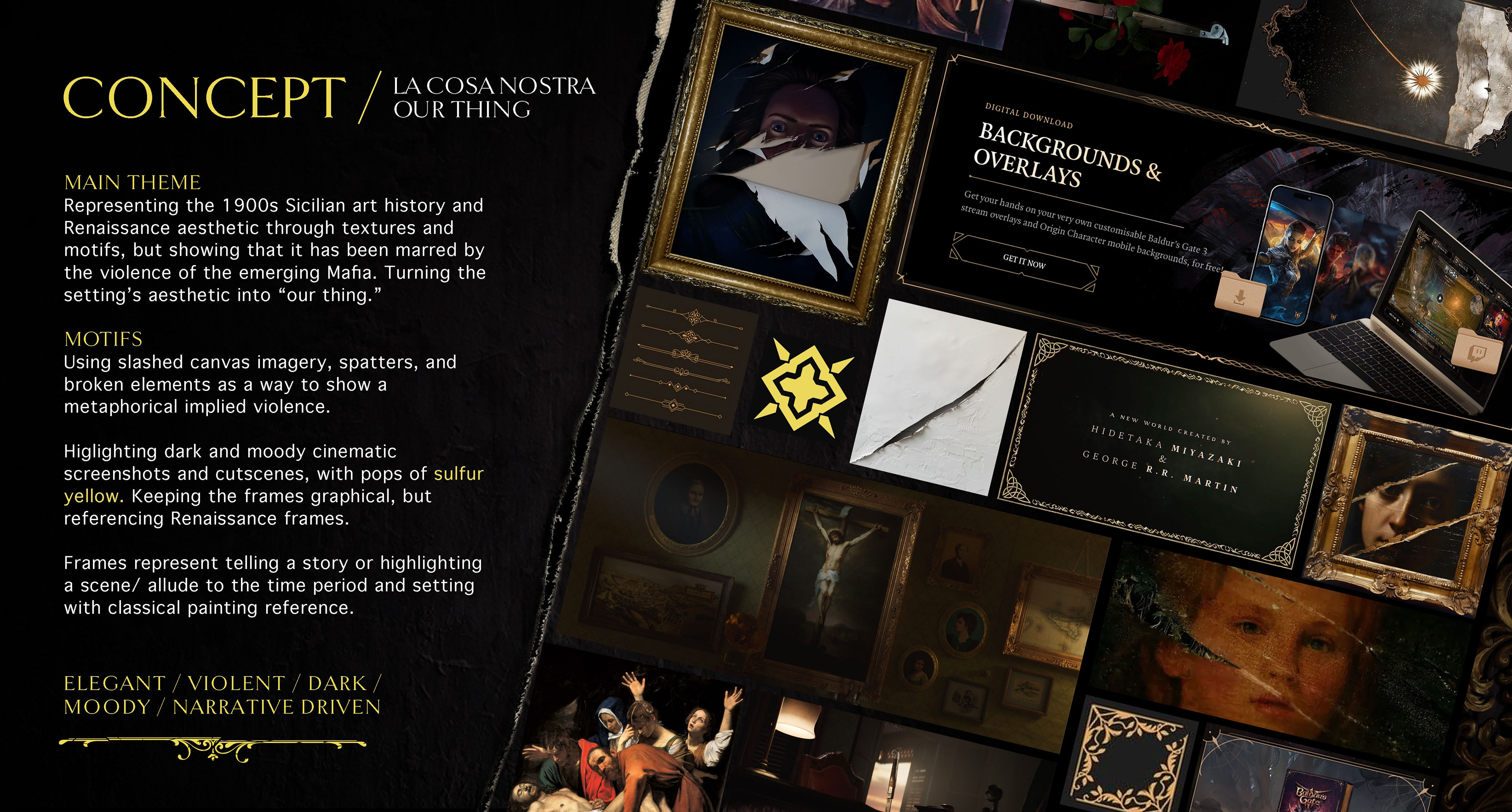
Initial Toolkit Concepts
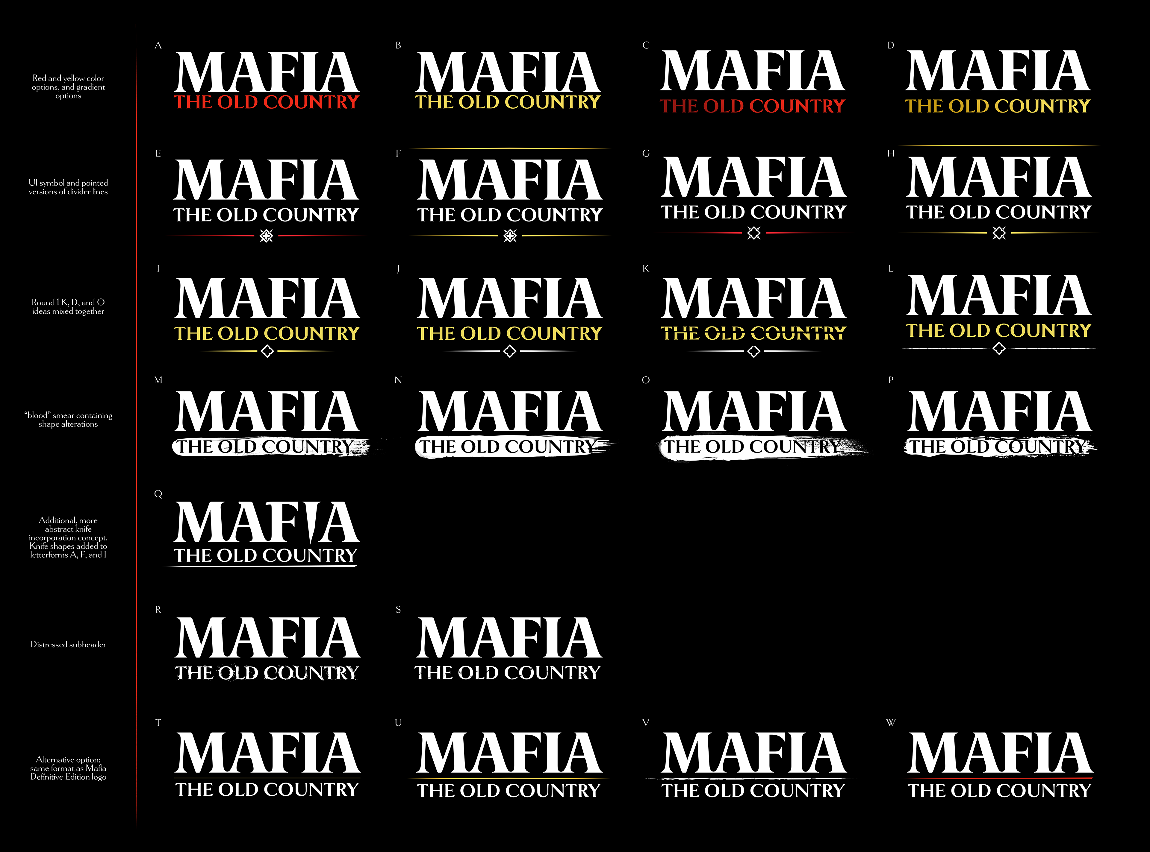
Below are the first pitches of the directions I proposed for the toolkit. I worked with the developers and 2K art directors to determine what tone and visual imagery was important to the game.
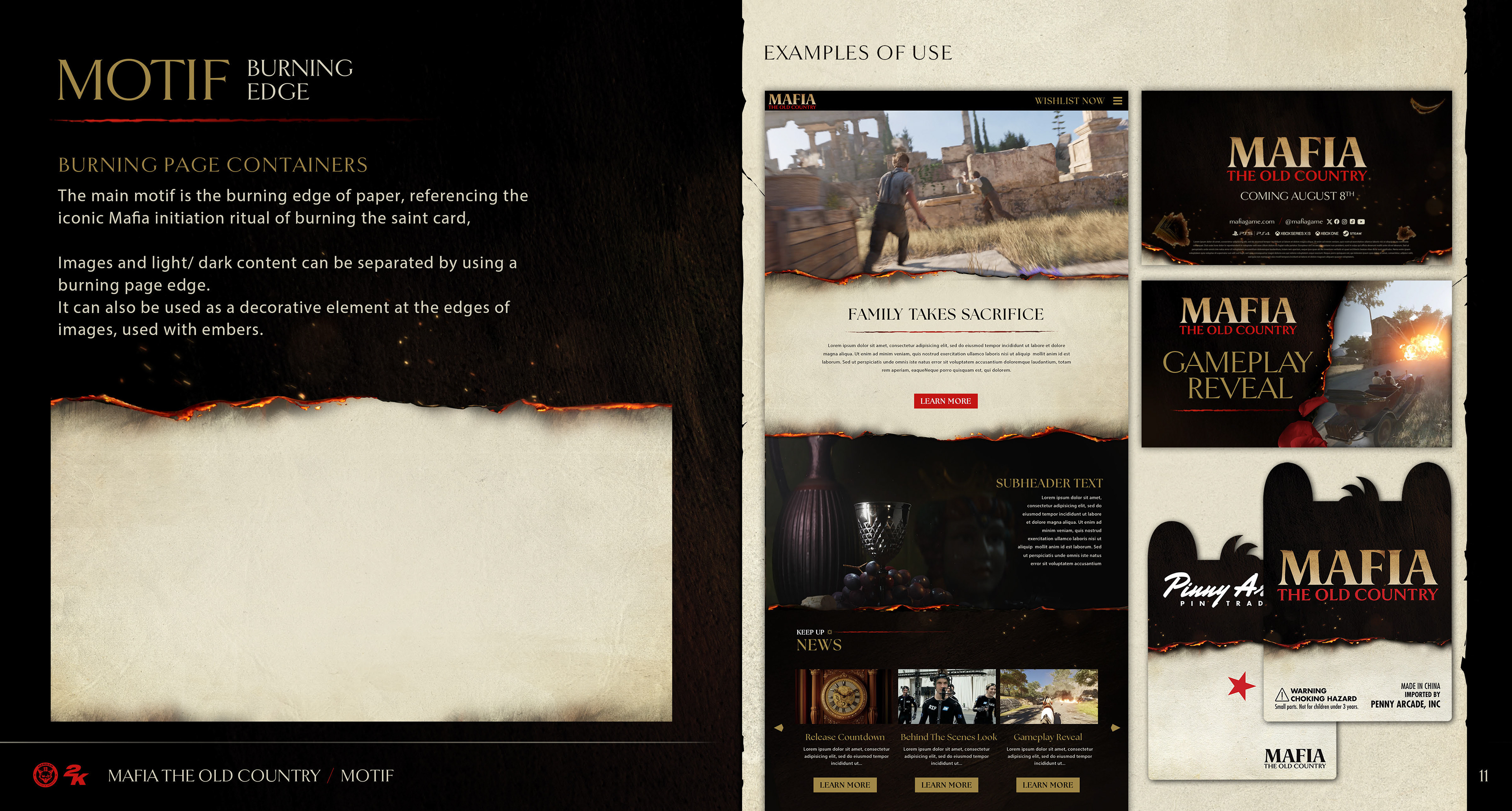
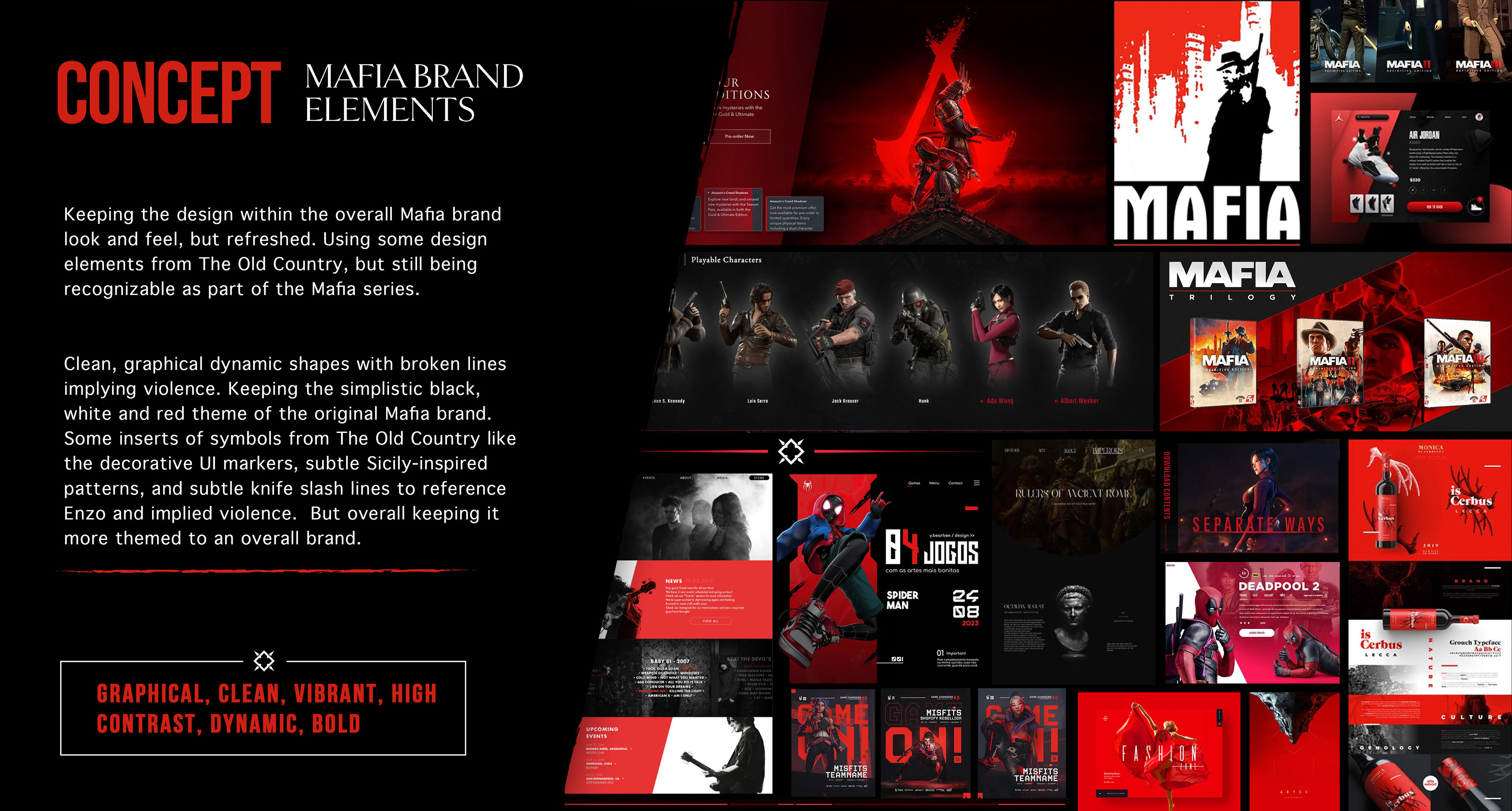
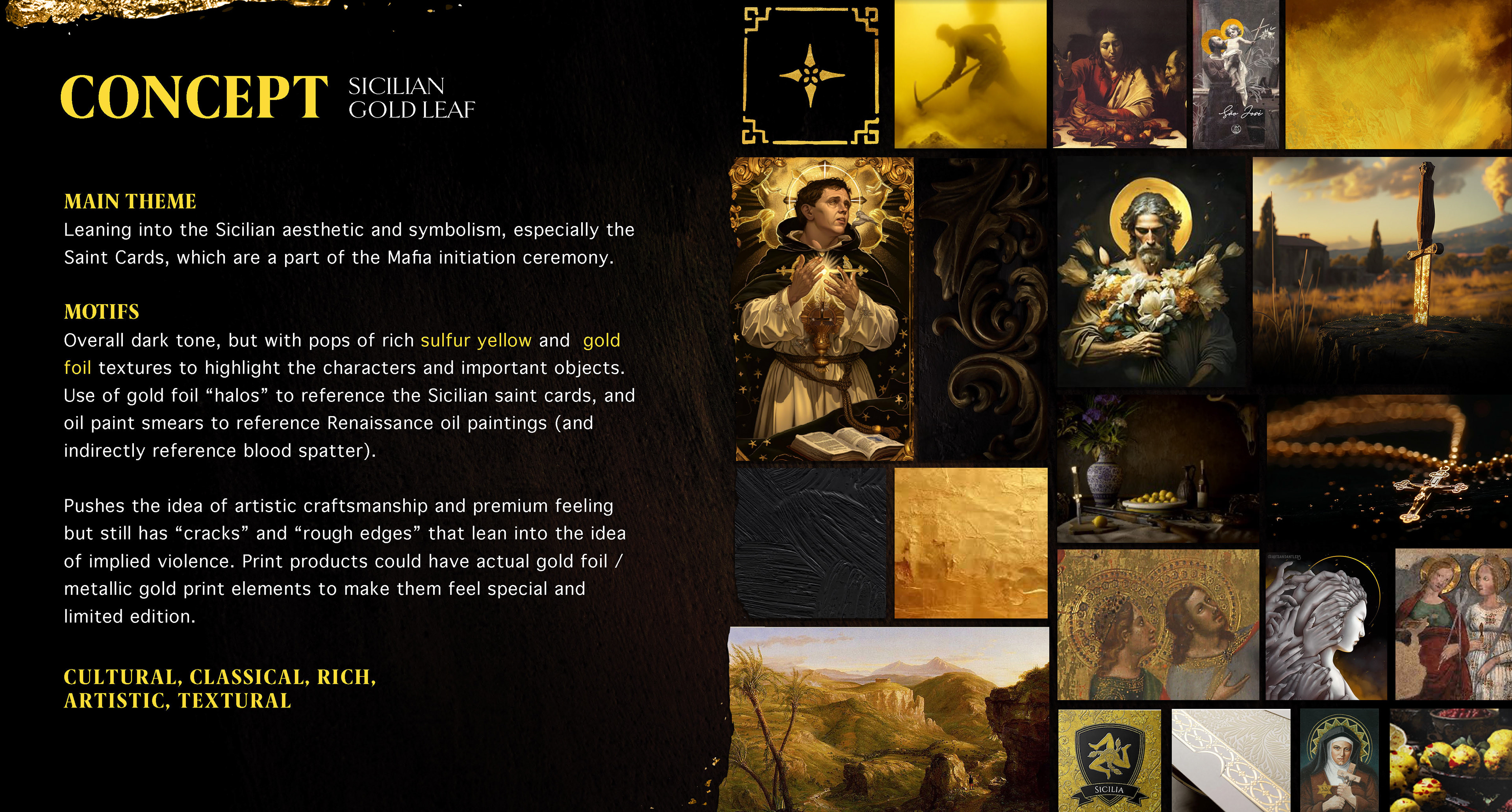
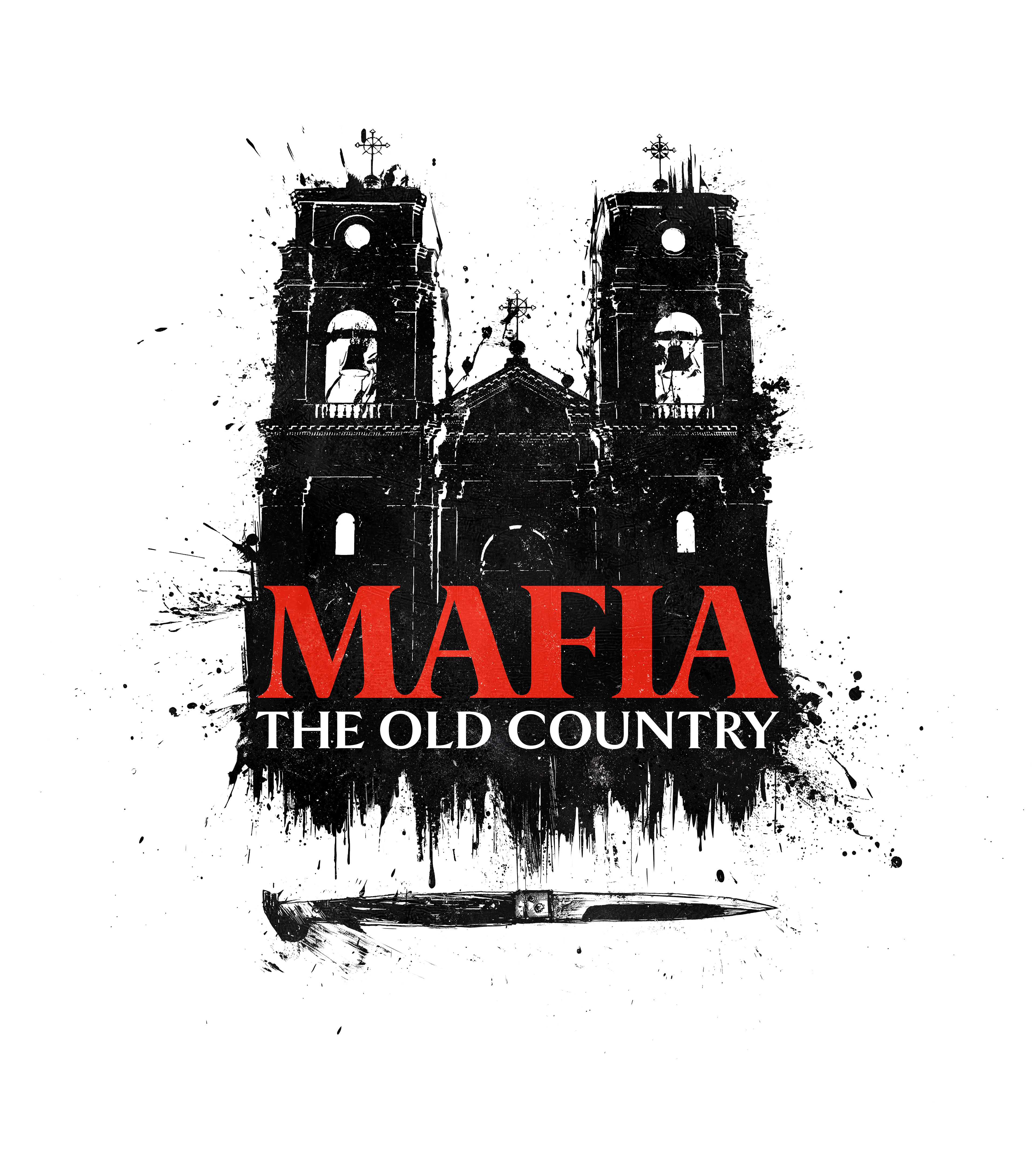
Initially, the "Cosa Nostra ("Our Thing")" direction was chosen. As the game developed further, and more cinematics and storyline emerged, the theme of the burning saint card used in Enzo's Mafia initiation ritual became an important symbol that we wanted to lean into, so I suggested using the burning page imagery as our main design motif and that became the essence of the final toolkit.
DIRECTION 1: LA COSA NOSTRA
DIRECTION 2: MAFIA BRAND UPDATE
DIRECTION 3: SICILIAN GOLD LEAF
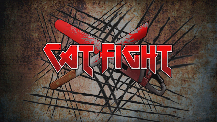
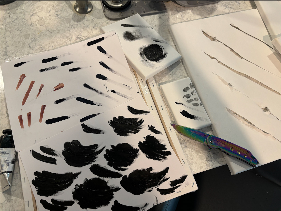
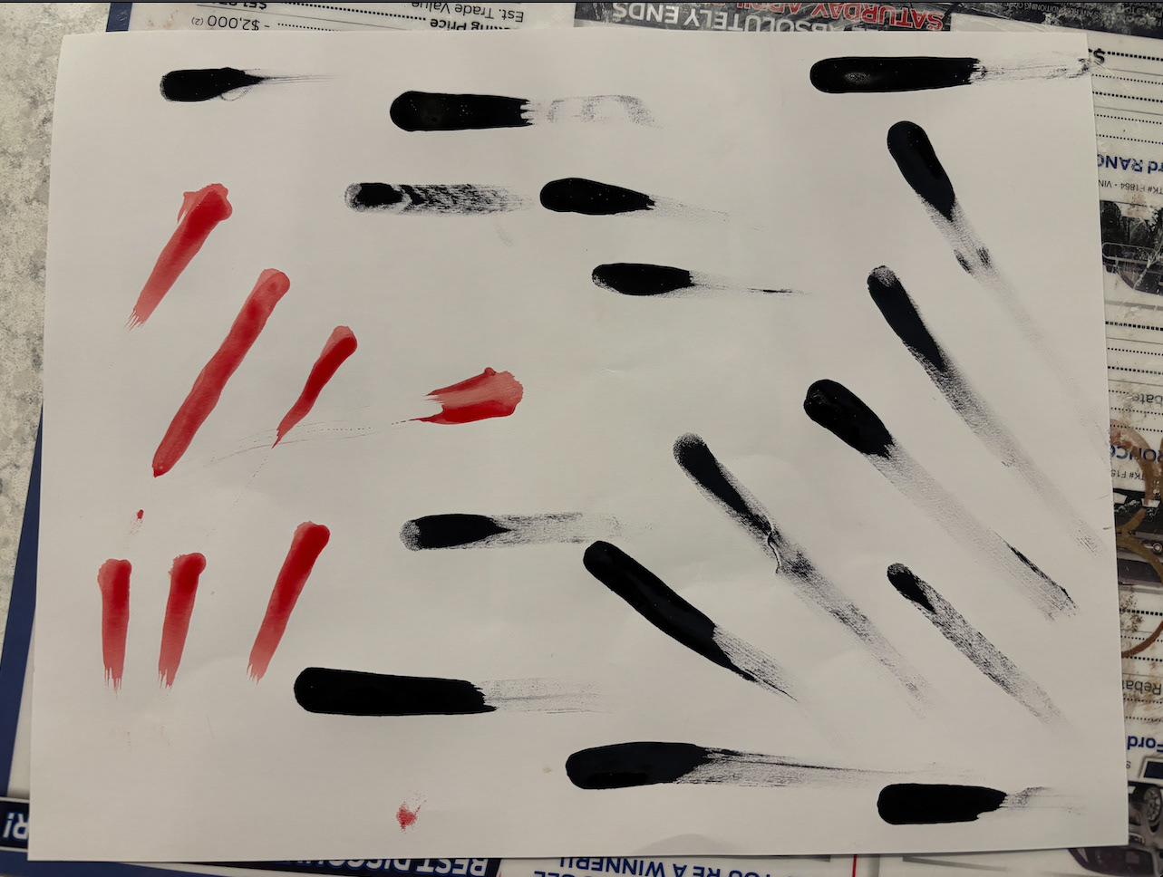
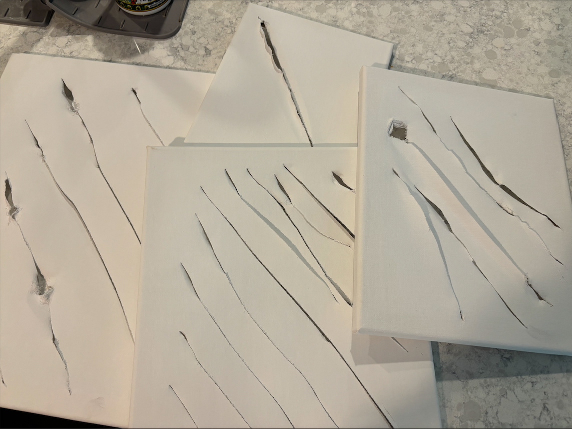
Blood, Sweat, and Tears
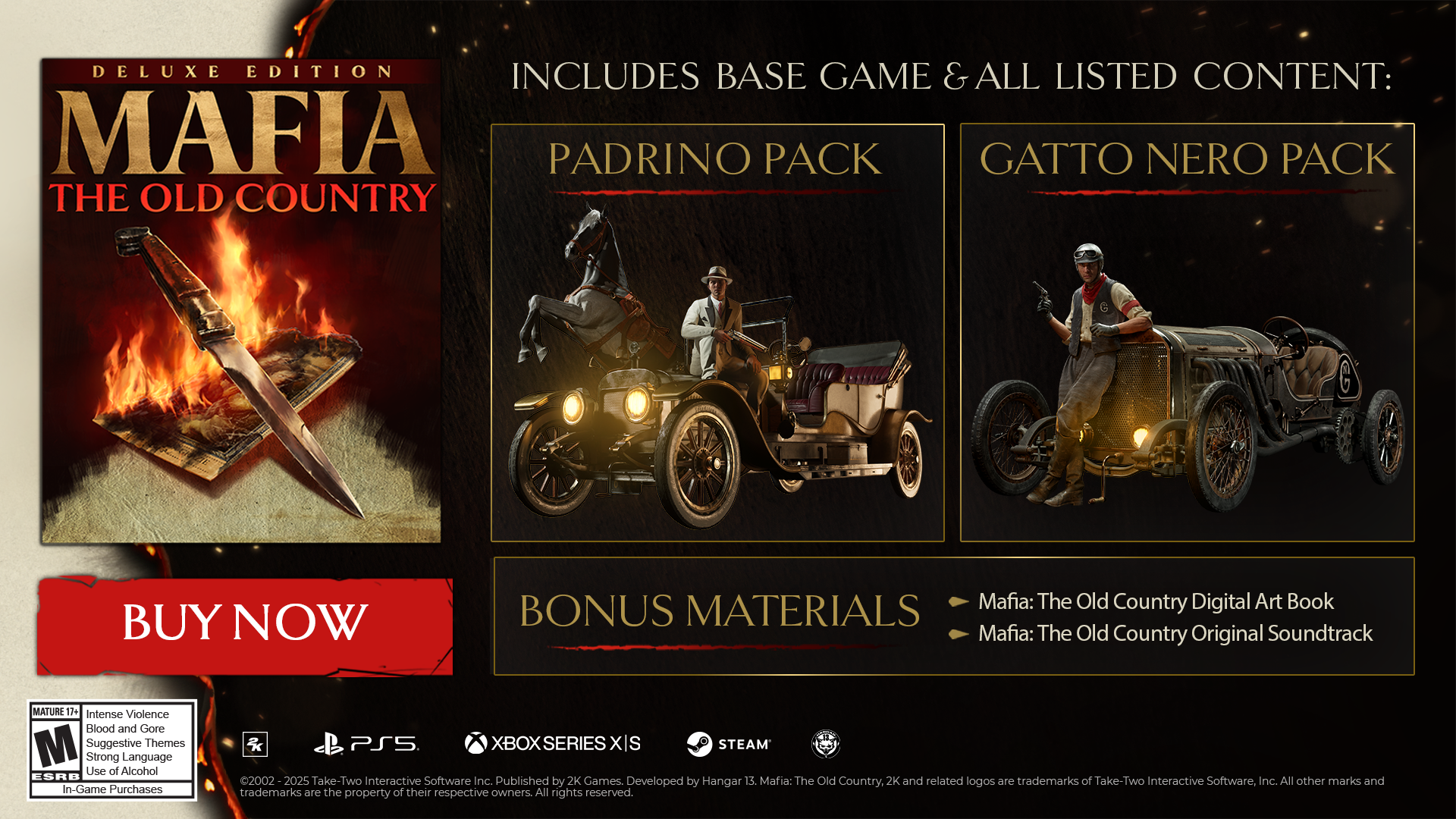
For this toolkit, I went analog, and made my own blood smears and slashes (yes, with my own blood) that I utilized in some unused logo concepts, key art elements, and was later used in the Deluxe Edition key art by art director, David Peixoto.
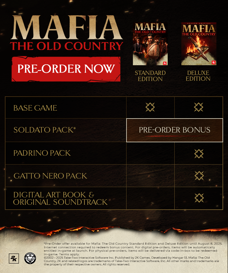
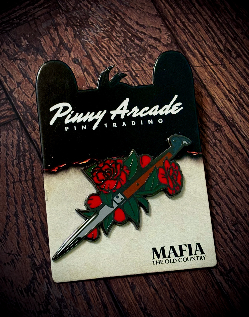
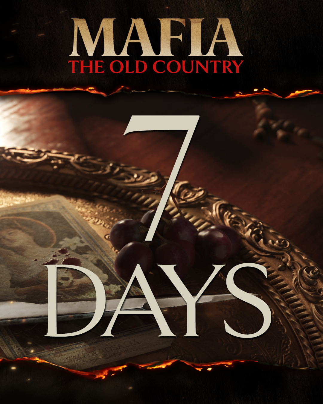
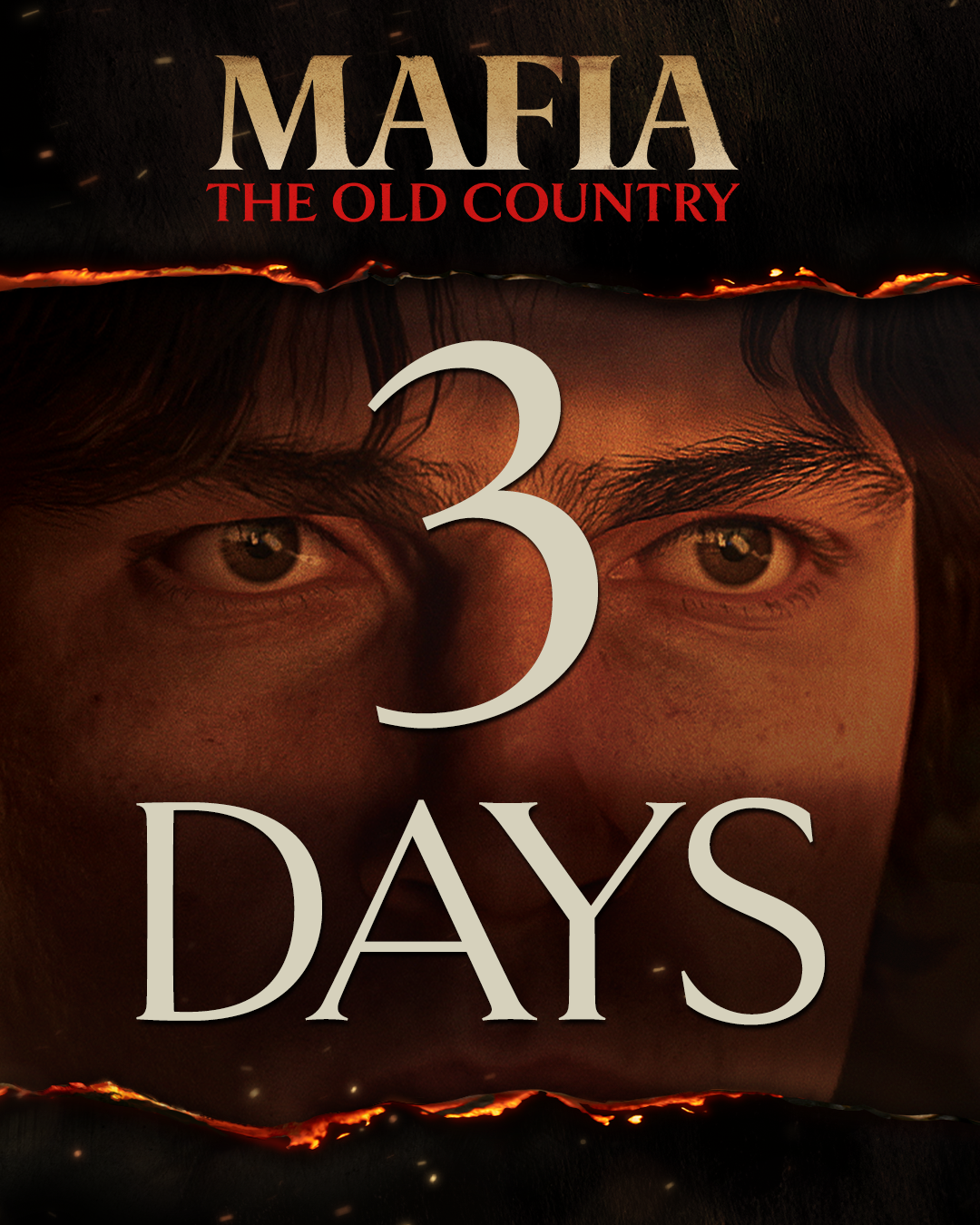
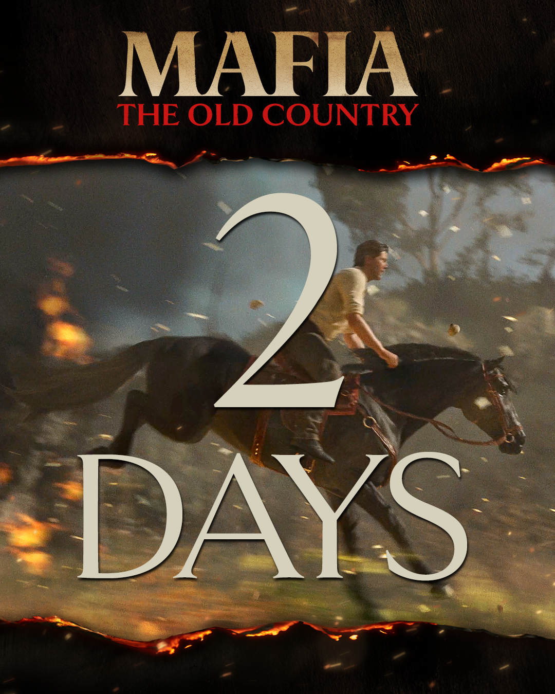
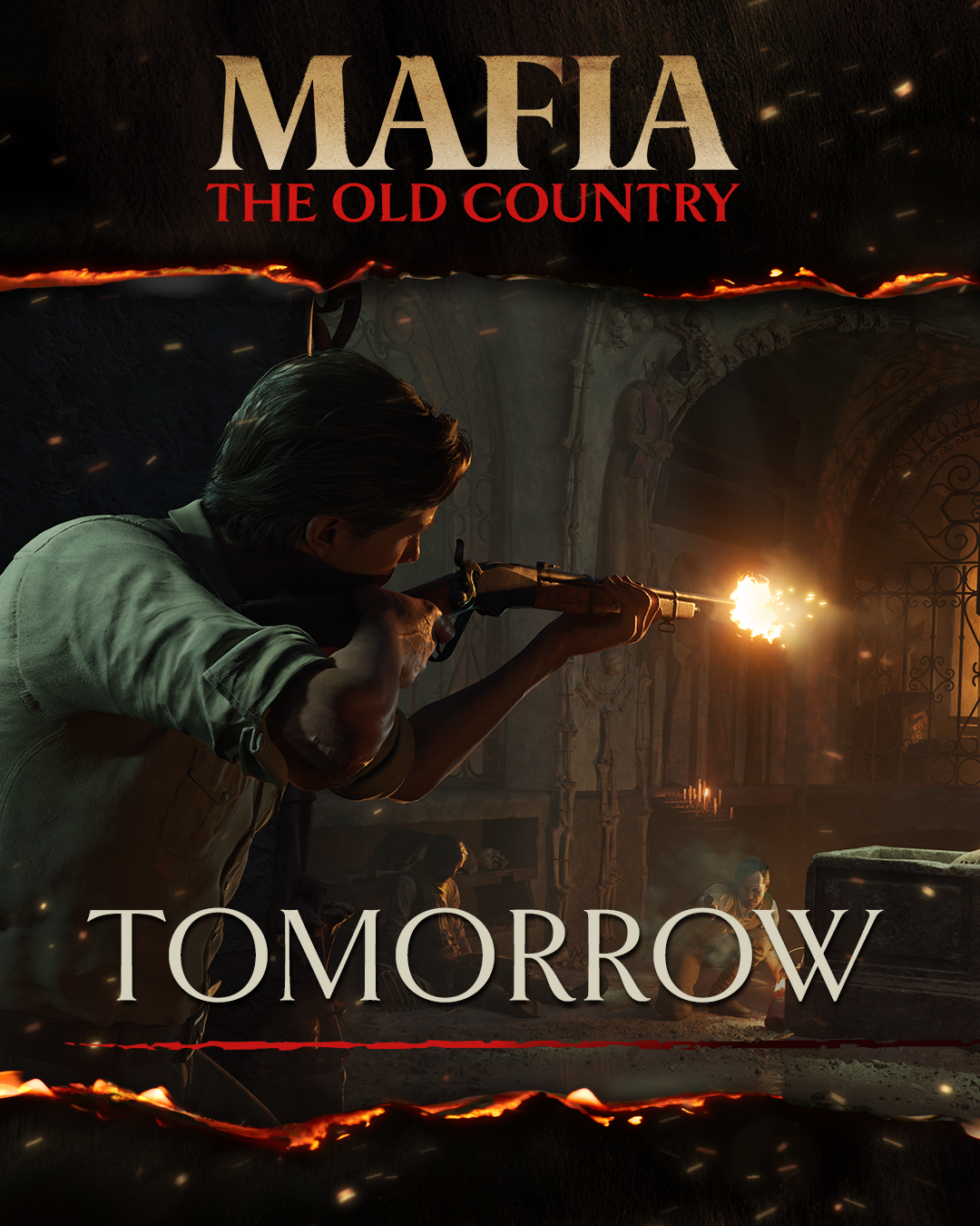
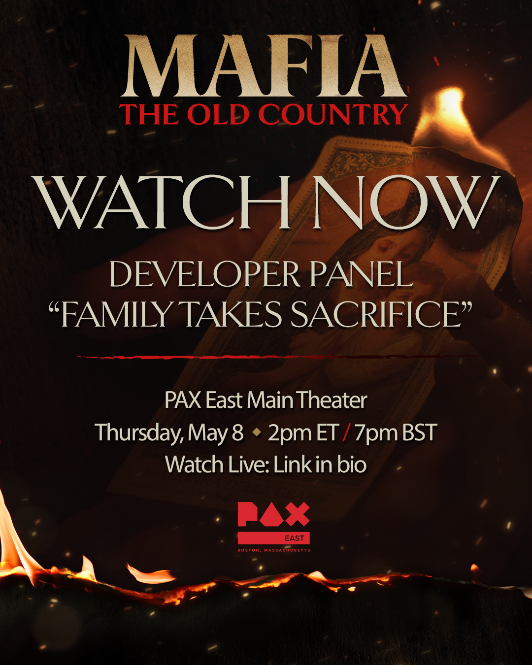
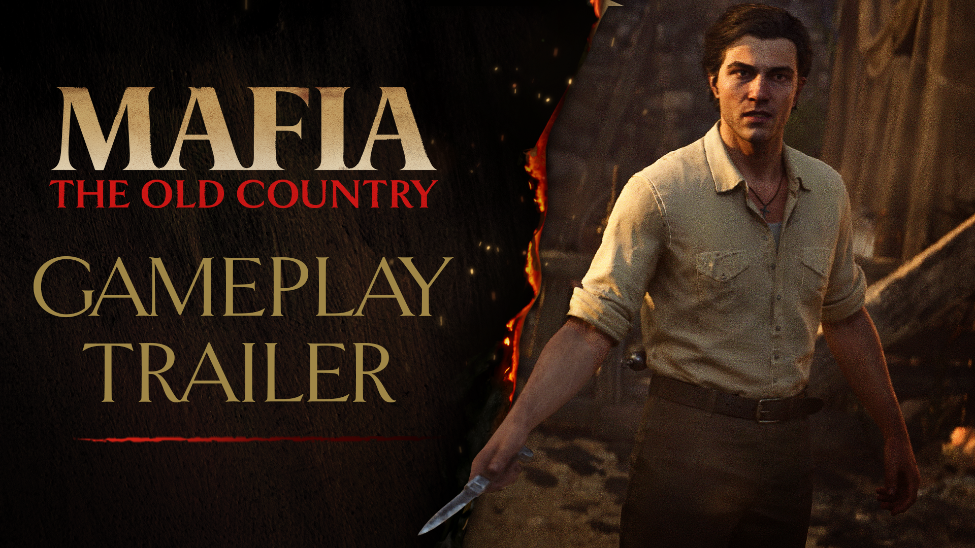
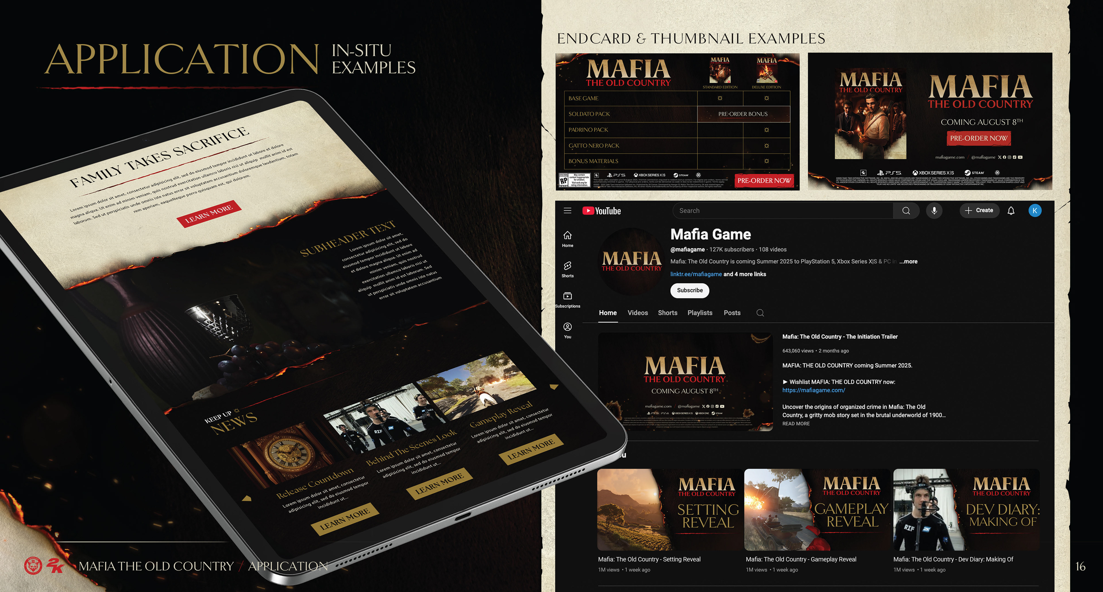
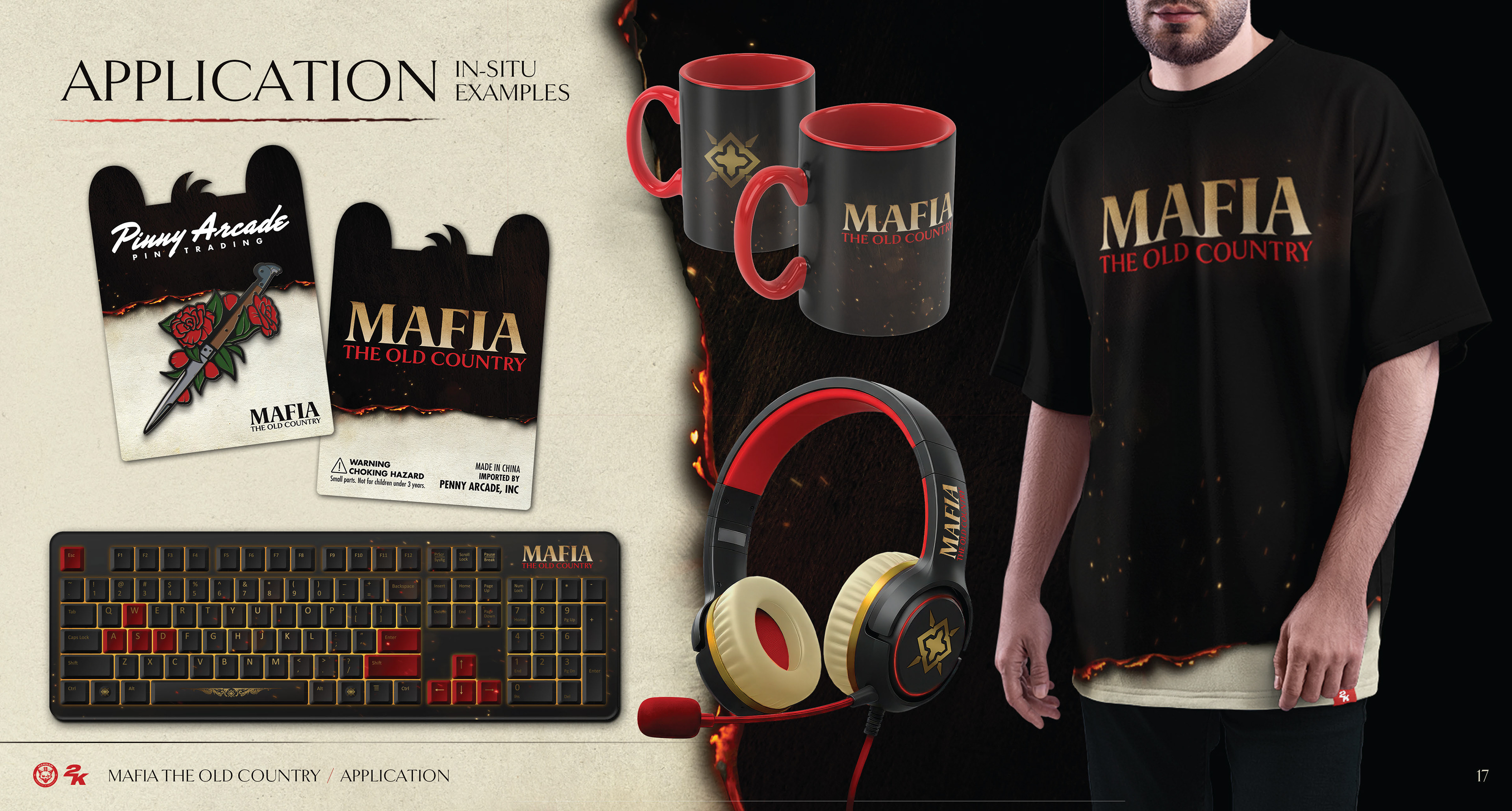
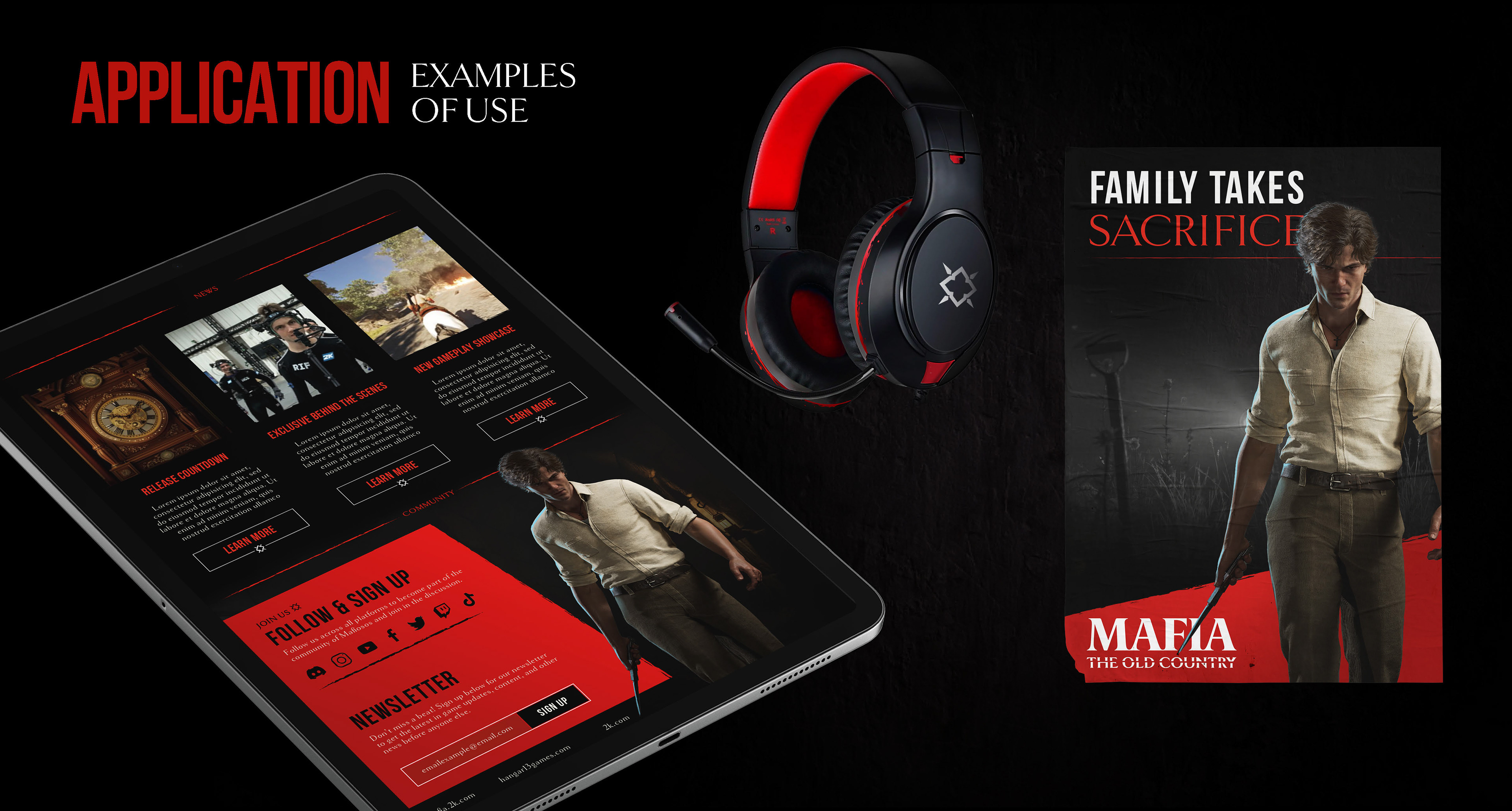
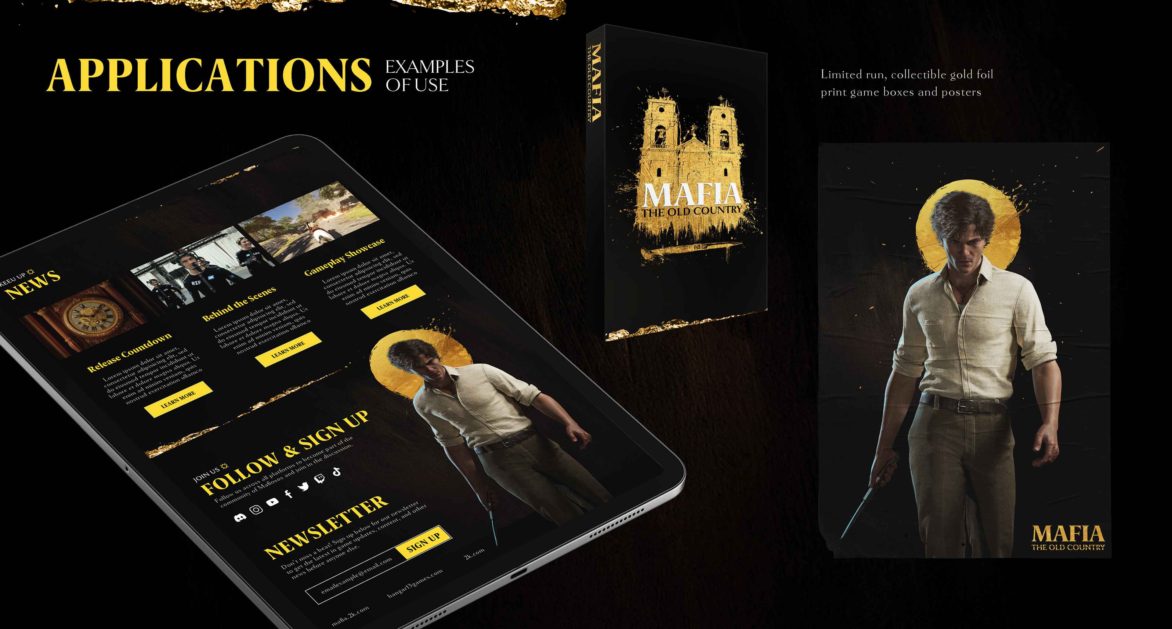
Marketing Assets
Additionally, I designed many marketing assets for the game. A few small projects included below which show the toolkit in use.